Embellished label samples let wineries see how finishes will look, printed with their exact graphics
Rebranding your wine or spirit product doesn’t stop with the finished label design. You also need to consider how your design will translate from pixels on a screen to a physical label on your bottle. And that comes down to production — materials, embellishments, printing.
But it’s impossible to visualize exactly how different materials and embellishments will look with your unique pressure-sensitive label graphics.
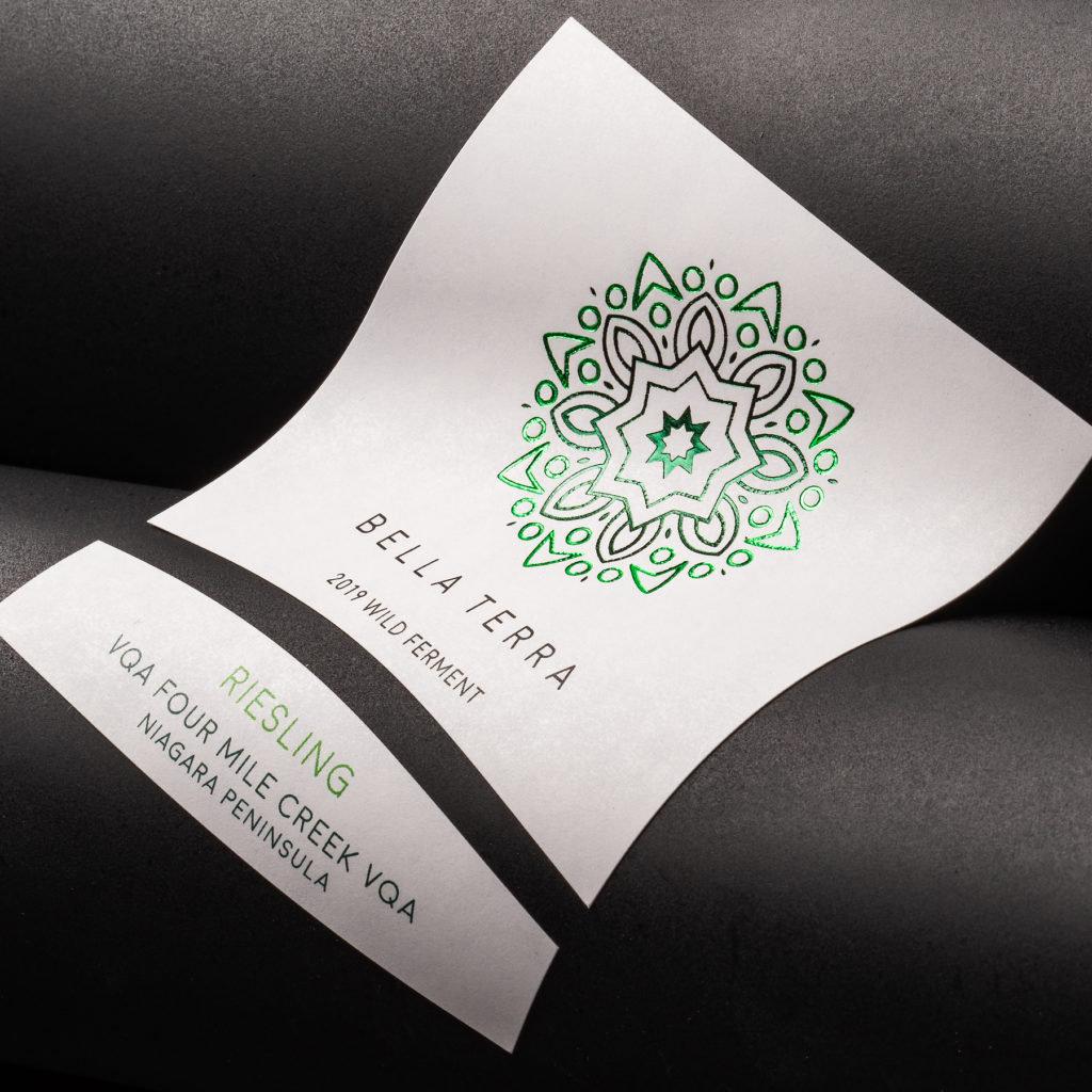
That’s why we’ll often send wineries fully embellished samples of different production concepts — so you can test each out on your bottle and decide which best represents your new brand.
With physical samples, you’ll know exactly what you’re getting when you place your first order. No surprises.
Here, we’ll walk through how we helped one Niagara Valley wineries achieve the right look, by walking them through the design process, and giving them full-production samples to make them confident in their embellishment and material selections.
PondView Estate Winery: Building a brand from the ground up
PondView Estate Winery has a rich, three-generation history of growing grapes and making wines in Niagara Valley. And while they’d built quite a bit of brand equity over the decades, they decided it was time for a change — and enlisted our help in rebranding their line of premium wines.
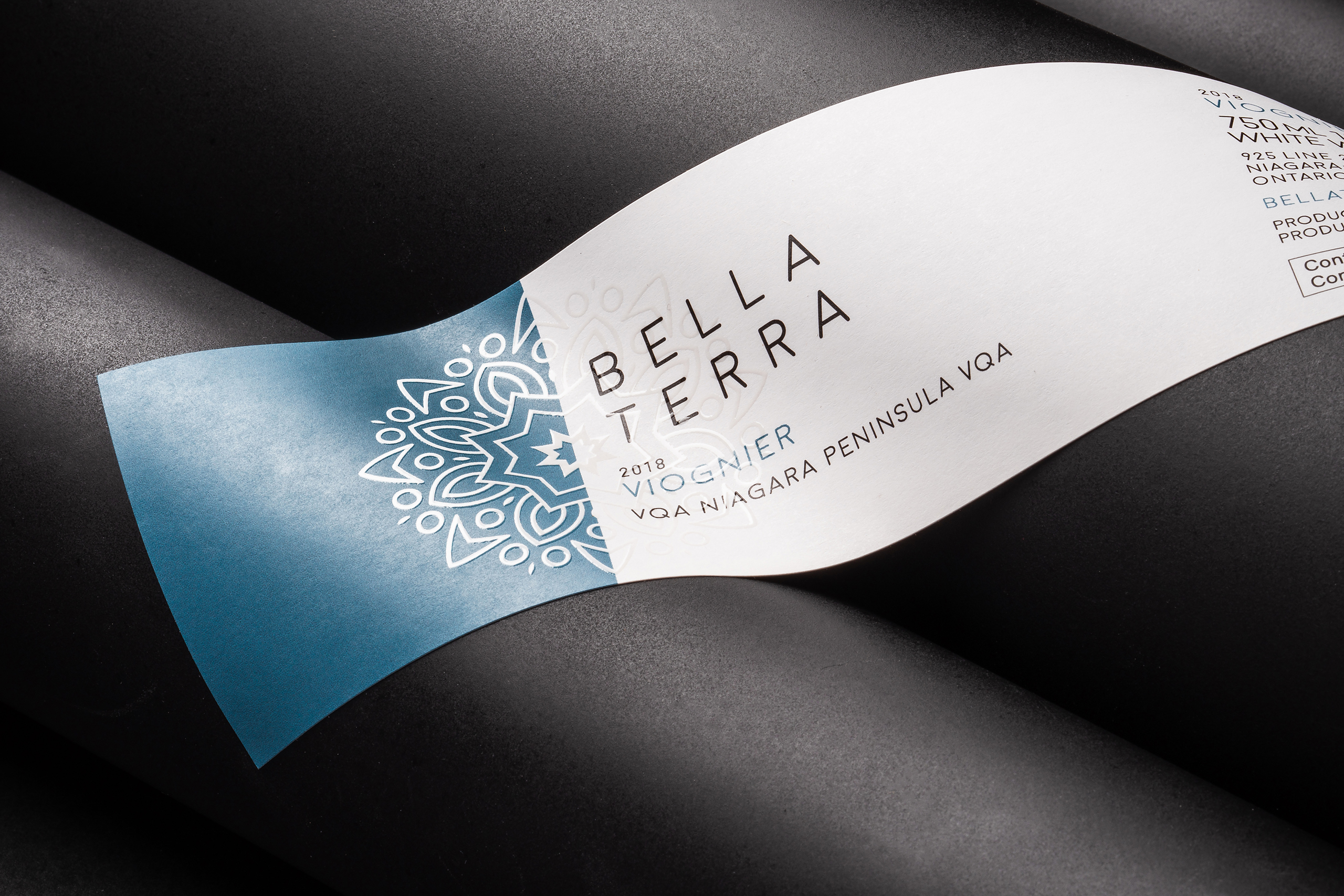
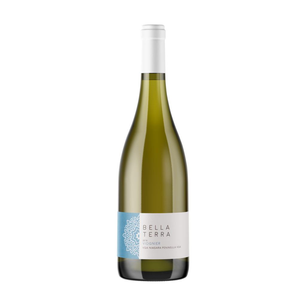
As part of the rebrand, they renamed the wine. What was once sold under the “PondView” brand would now be marketed under “Bella Terra,” meaning beautiful land. It’s the perfect name for their finest wines, grown and made on the “bella terra” of their Niagara vineyard.
This was a complete, 180-degree rebrand — and the labels needed to be updated in order to elevate the appearance of the Bella Terra bottles on the shelf, complement the wine in the bottle and justify the premium price point. It was a massive undertaking, so we rolled up our sleeves and got to work.
A quick overview of PondView Estate Winery
- Location — Niagara Valley
- Primary problem — Creating a more elevated packaging look for their premium line of fine wines
- The solution — Completely rebranding their label design, and using full-production label samples to select the right embellishments
- Added benefits — Baking label cost savings into the redesign through smart production planning
Labels that look the part
Our design partner began by brainstorming multiple concepts with the PondView team, and finally refining it down to one, completed design– a minimalist design that elegantly projected the sophistication and quality of their wine.
Production-focused design conversations
With the final design in hand, our team was looped in to discuss production, deliberating questions like:
- How will we carry this design across multiple SKUs, while still ensuring they can all be produced in one print run?
- How can we leverage our production technologies (varnishes, embosses, stamping, etc.) to elevate this design, and take it up a notch?
- What printing technology presents the best value for these labels?
This type of production-focused conversation not only helps you take your design to the next level with the right embellishments, but it also builds in production, cost and turnaround efficiencies. It ensures everyone (your team, designer, printer) is considering production constraints and possibilities from the outset of the rebrand.
- The line used just two shapes, die lines — one for their varietals that would be placed in a Burgundy bottle, and another for those that would be placed in a Bordeaux bottle. Colors would be used to distinguish between varietals. The simplicity of the shape and design across this line of wines will build brand recognition, and also allow their label orders for all varietals to be grouped together on the press, streamlining production.
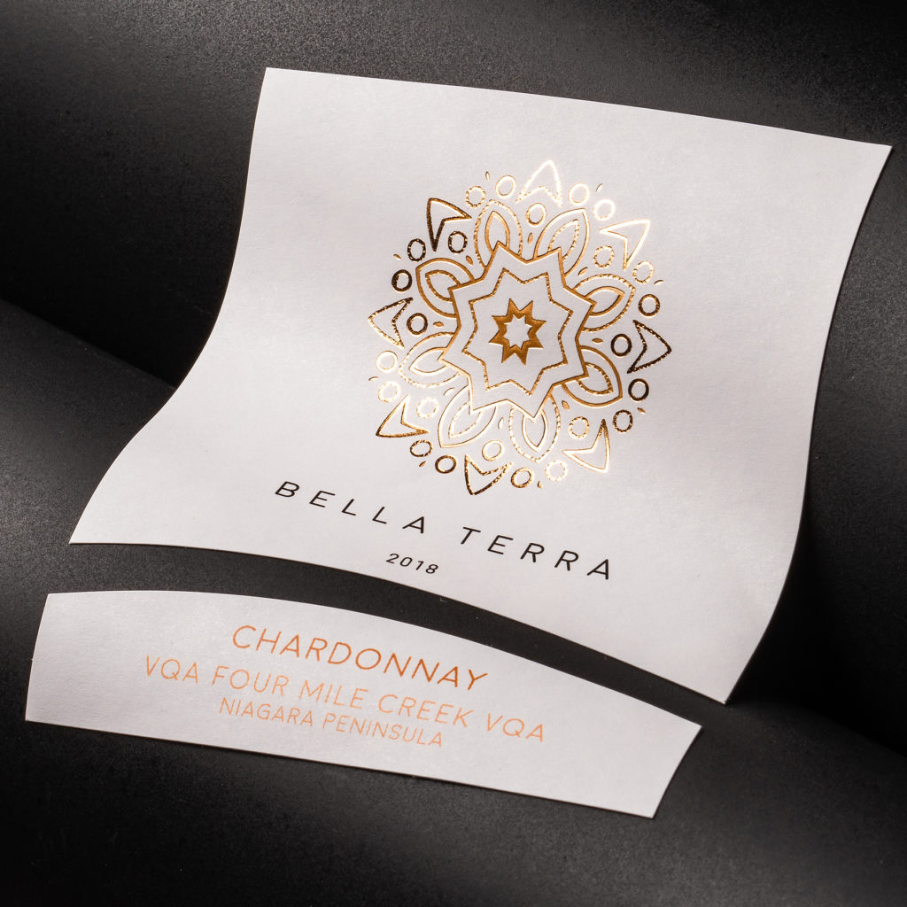
- Fully embellished samples were sent to the PondView team to review. They got to see how embellishments (varnishes, hot stamping, micro-etching, embossing) actually looked on different stocks (felts, flat papers, welds, etc.) printed with their label design. Ultimately, they ended up going with micro-etching and hot stamping on a flat matte weld — which they were absolutely sure they would like before they ordered even one label, because they’d been able to compare it to a range of other options.
- Plate-free digital printing ended up being the best fit — especially since the color and information needed to be varied within one print run to distinguish varietals.
Our production-focused guidance added value and helped build efficiencies into their rebrand from the start.
Price-sensitive label solutions for their entry-level line of wines
After the success of the first redesign, PondView wanted to introduce an entry-level line extension to the Bella Terra brand. These wines would come in at a much lower price point, and the PondView team needed more cost-effective labels that still capitalized on Bella Terra’s brand equity.
The first thing we did was update the label shape, optimizing it to cut material and production costs. And the sleek, simple label anchors low, allowing the bottle to breathe, and gives a much more approachable look for this economical line of house wines.
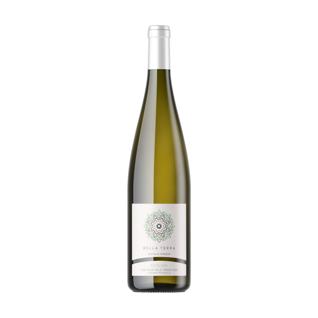
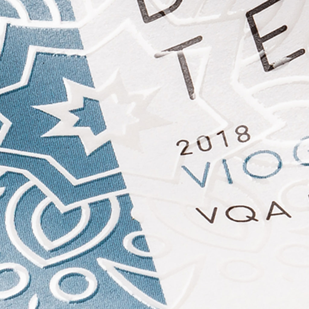
They kept the same material — the flat matte weld — but switched to more cost-conscious embellishments. While the high-end Bella Terra wines used a hot stamp over the medallion, we recommended they switch to a cost-effective raised varnish for these entry-level wines. Embellished labels are within reach at many different price points, both high and low. It’s about aligning the right embellishments for the right brand.
A seamless rebrand
The entire design process took a week, if that. And because they were able to select the exact samples that best represented their brand, there were absolutely no surprises when their first order came in.
Seeing is believing
If you’re planning a rebrand, and need help designing new labels from the ground up, or would just like embellishment selection advice, let us know. With the capability to give fully embellished labels — not from a swatch book, but samples printed with your exact graphics — you’ll know exactly what your labels will look like before ever placing your first order.
Tags:

