Consulting with an Ontario-based winery to create a top-selling label

Rosé wines, either still or effervescent, are now a staple on store shelves and in wine coolers across the country. But before the recent trend in North America exploded, an Ontario winery prepared for their launch of LOLA, a sparkling rosé wine.
The blush colored wine from Pelee Island Winery was ready. But it needed a show-stopping label to go along with it.
Enter A1 Label, a Resource Label Group company. As their trusted label converter, we coordinated with their design agency and played an essential consulting role in the label production process. We recommended finishes, embellishments and stock to take the agency’s floral concept to the next level. In addition, we provided holistic packaging advice and supply chain cost efficiencies for the winery, too.
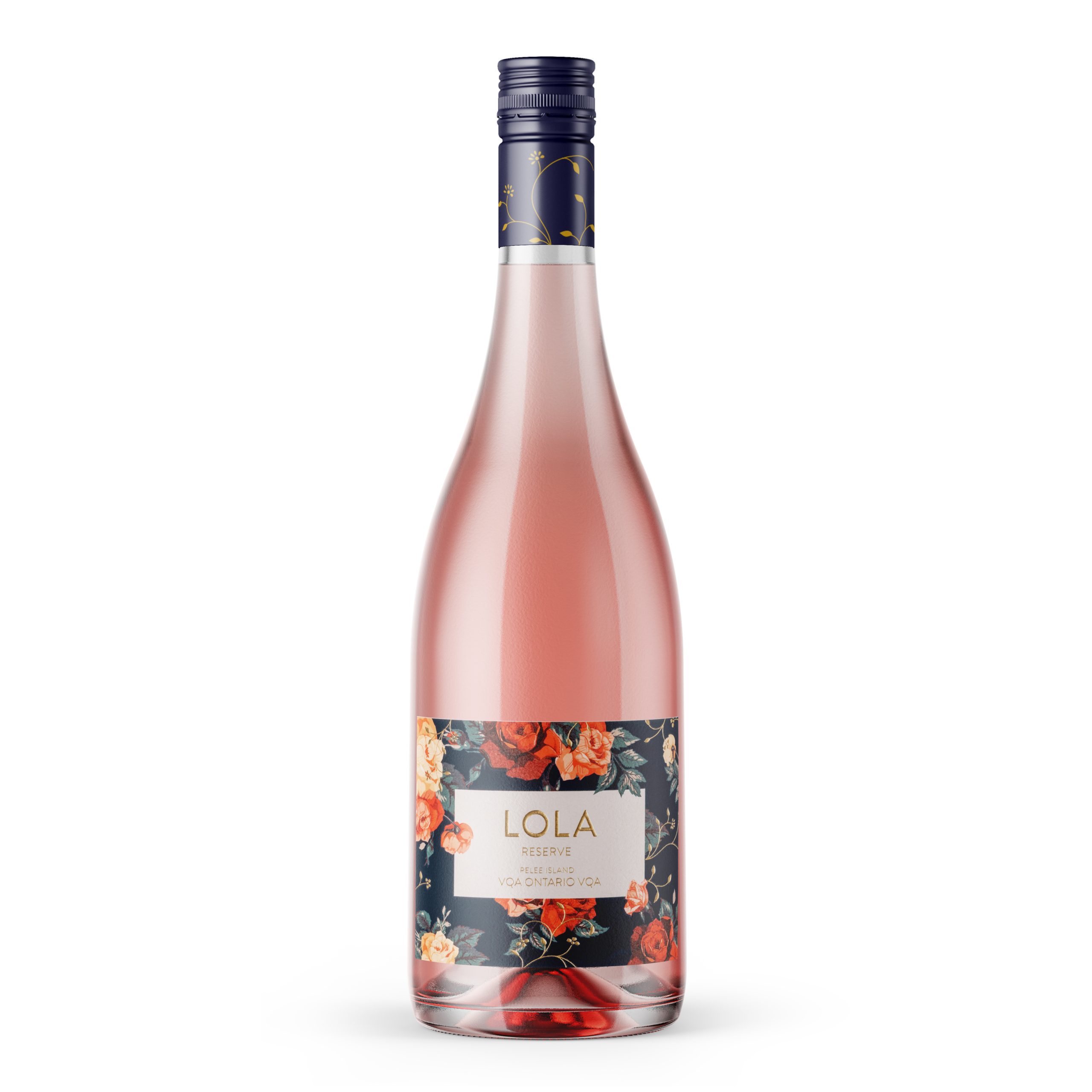
The result? A best-selling product, label spend reduced by 20% and an iconic brand look that has since been expanded to eleven different wines.
A quick overview
- Location — Ontario
- The problem — Create a best-selling label for a sparkling rosé product launch
- The solution — Bold recommendations on finishes, embellishments and stock
- Results — #1 selling VQA wine, nomination for Best New Product Launch
- Added benefits — 20% cost reduction, guidance on quality package design
Collaborating on a modern design with striking embellishments
For the launch of LOLA, Pelee Island Winery needed a label that would catch the attention of young millennial women (the target demographic) amongst other rosé varietals. Their design firm landed on inspiration from the interior design and fashion industries: A sophisticated floral pattern that was already resonating with young millennial women.
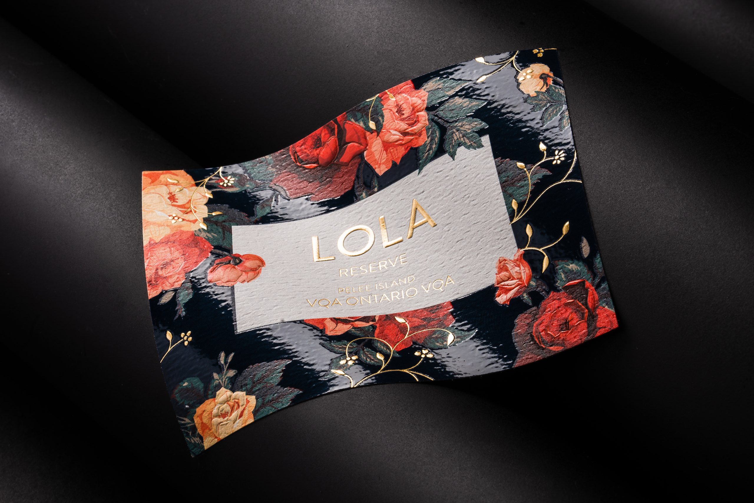
But to take the design off the mood board and onto the label, a consultative label manufacturer was needed.
We worked closely with the design agency from the beginning. With our deep understanding of labeling technology, we were not only able to execute the client’s vision, but also recommend eye-catching embellishments that may have never come up otherwise.
First, we proposed different types of embosses, varnishes and hot stamping in an array of colors. Without any embellishments, the label would appear flat on the shelf and not be nearly as attention grabbing as the design agency intended. After presenting Pelee Island Winery with samples of our ideas, we agreed upon the most impactful combination of techniques.
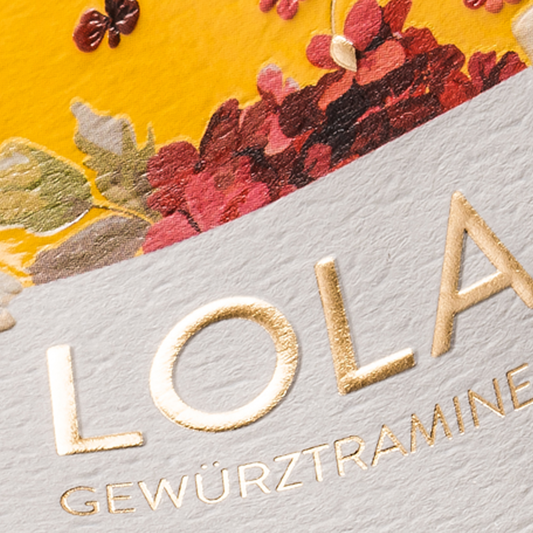
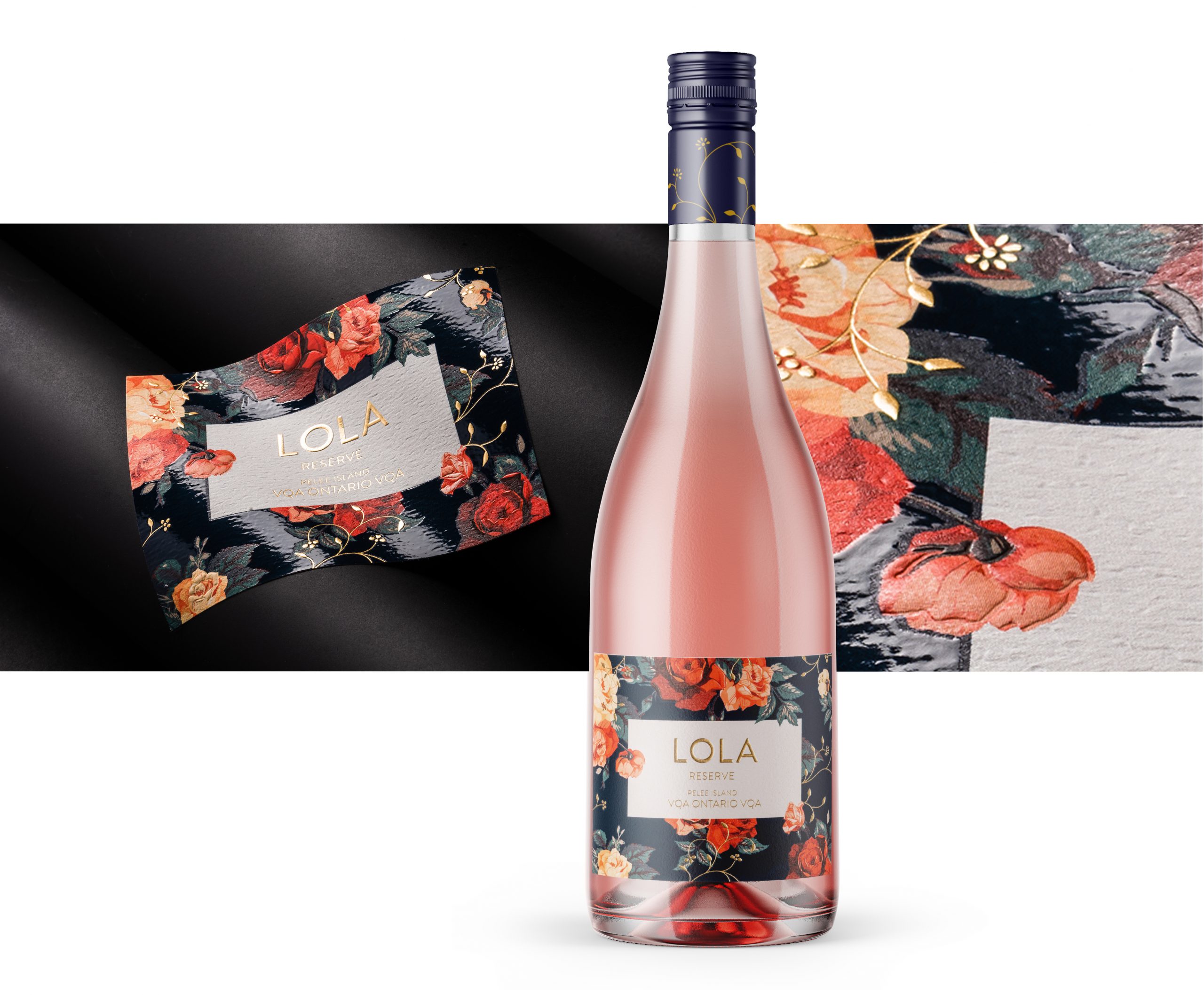
The hot stamp was a natural choice for the typography, creating a lustrous, shining quality and catching the eye immediately. Additionally, our team added the gold foil to sections of the flowers for an additional pop, and included a varnish for the navy background. This final element creates a striking contrast between the high sheen gloss of the background and the textured, more natural-feeling flowers.
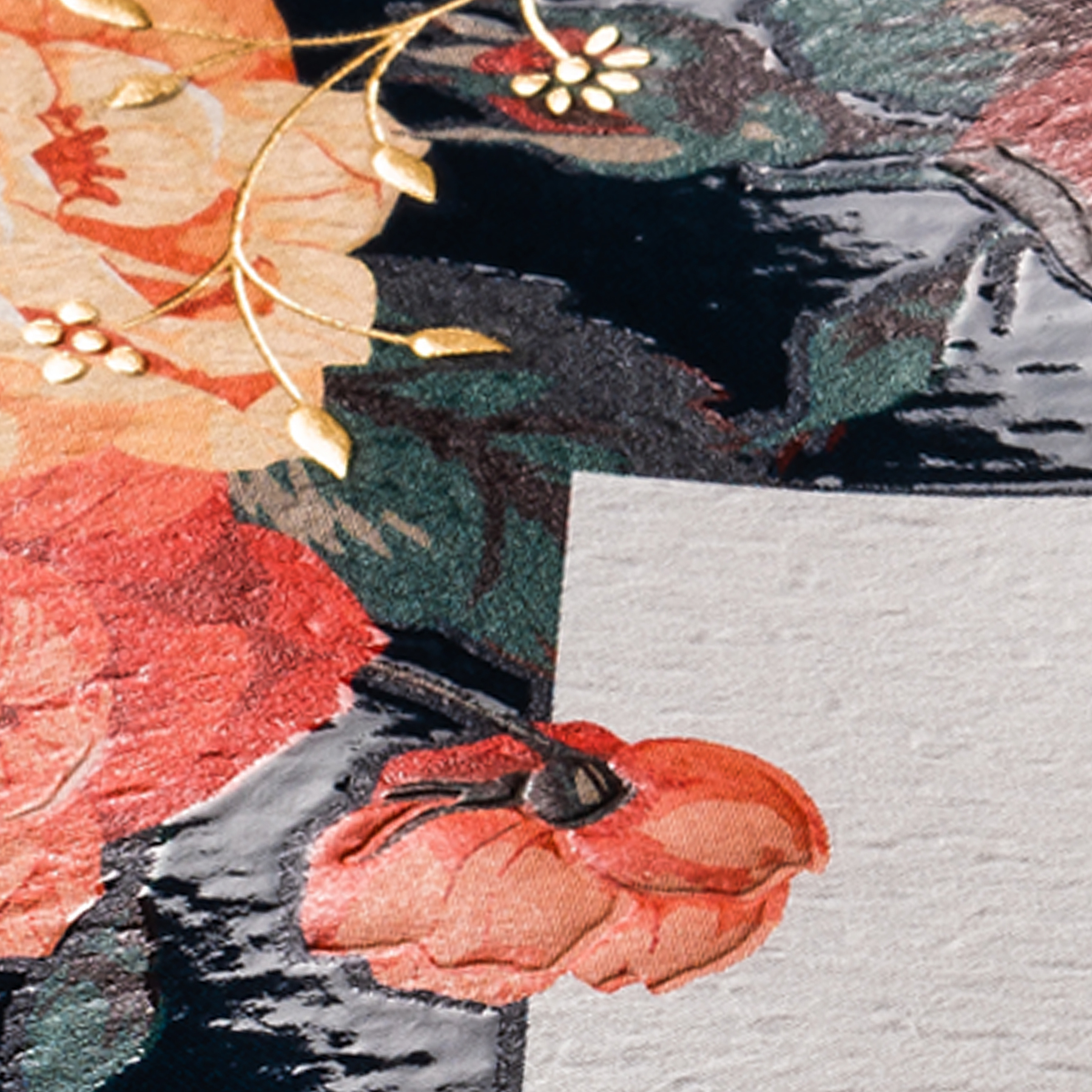
The achieved effect of the label is romantic, feminine and decidedly modern — an exact right fit for Pelee Island Winery’s target customer and an expert execution of the design concept.
Guaranteeing consistency across packaging components
The label is one piece of the entire packaging puzzle. We often see wineries keep conversations amongst packaging components siloed off, preventing design consistency.
For example, just a “standard white” cap can end up being many different shades, from a cool off-white to a warm cream color.
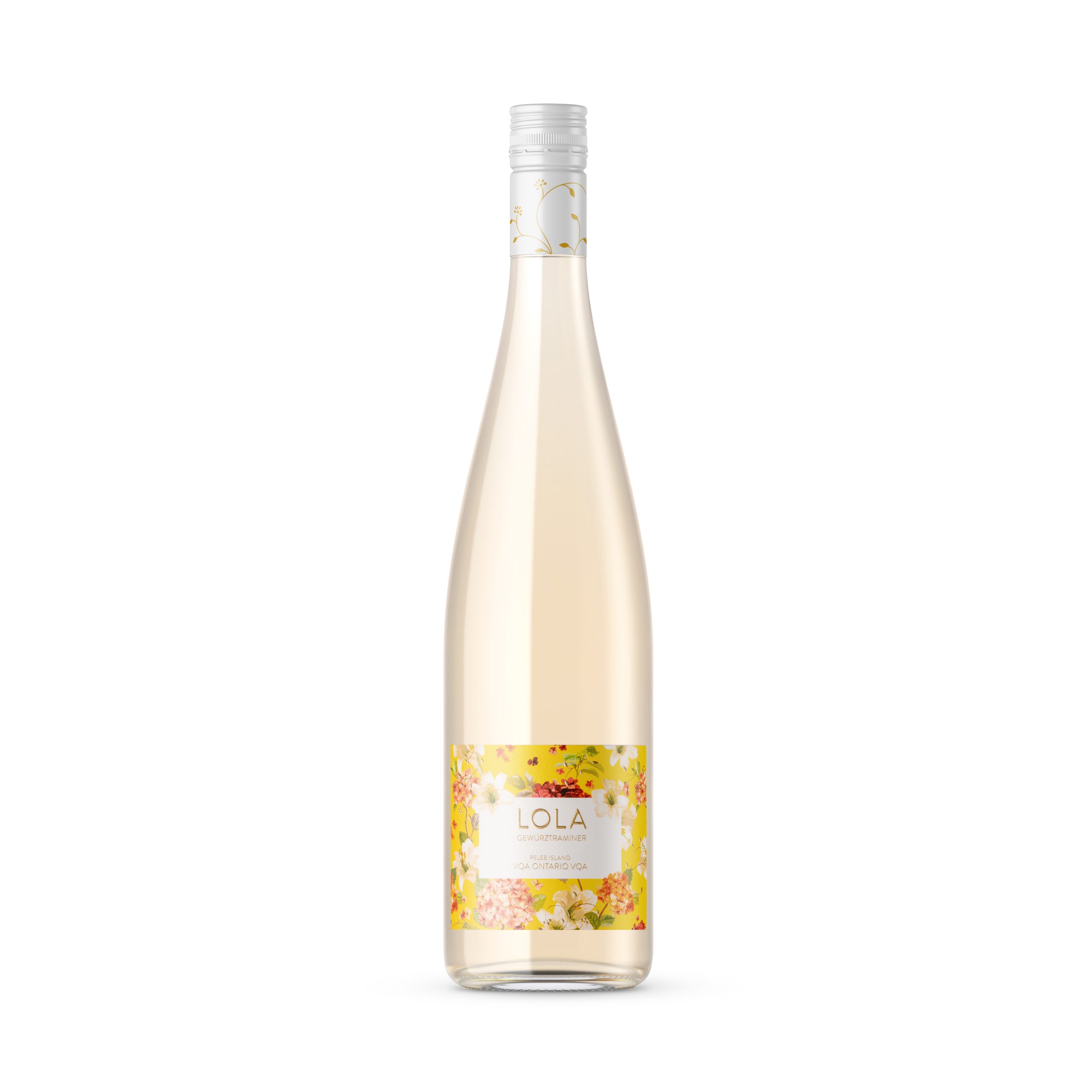
To guarantee design coordination, we looped in Pelee Island Winery’s cap provider from the start. We made sure the cap color matched the exact shade of the background, and even carried over similar embellishment techniques from the label.
This forward-thinking process ensures more cohesive packaging and an overall elevated look.
Reducing label spend by 20%
Our role as Pelee Island Winery’s label manufacturer didn’t stop at expertise-driven design insights. We also shared supply chain guidance to streamline their label spend where possible.
We talked about their label ordering process, showing how looking ahead and ordering multiple SKUs at once (i.e. a rosé label and a white wine label) can benefit them from a costing standpoint.
In addition, we advised the winery to choose a more cost-effective stock for their back label. The front label is a beautiful felt material and includes the embellishments discussed above and must draw in the customer.
The back label, however, is information only and serves a more utilitarian purpose — so a cost-effective stock makes the most sense. This approach encourages investment where the impact matters most (i.e. the front label) and streamlining costs where possible (i.e. on the less visible back label).
This decision alone helped Pelee Island Winery save about 20% on their LOLA label spend.
The bottom line
Since its launch, Pelee Island Winery received a nomination from the Liquor Control Board of Ontario for Best New Product Launch. The sparkling rosé is also the number one selling VQA wine.
LOLA has now been expanded into eleven other varietals, ranging from a classic Pinot Grigio to a unique, Lambrusco-style sparkling red. Each wine showcases a different floral pattern, but is unified in the same recognizable design. Pelee Island Winery has even added a 250-mL slim can of the sparkling rosé, a completely new package for them.
These expansions wouldn’t be possible without successfully engineering the first LOLA label — and we’re proud to have helped lay the foundation for a successful brand for Pelee Island Winery.
How a label partner finds value for you
Pelee Island Winery didn’t just get a label printer — they got a true partner. See the National Reach, Local Touch difference for yourself.
Launching a new varietal soon?
You want a bold label design that will resonate with your customers. A consultative labeling partner can help you achieve that.
At Resource Label Group, we are experienced in collaborating with designers, providing design-related guidance and engineering labels that reflect your vision. And we help streamline ordering costs along the way, too.
Simply reach out to our team to start the conversation.
Tags:

